
Taking performance reviews and training from painful and boring to simple and meaningful.
Date: 2016
Company: Cornerstone is one of the world’s largest companies in the HR technology space helping organizations modernize their learning and development experience. Cornerstone serves over 6,000 customers and 75M users and is available in 180 countries and 50 languages.
Role: I led the charge on the entire UI/UX design for a brand new product. I closely collaborated with my design team friends and key stakeholders as well as deeply invested time with our customers to understand who they are and what they needed out of the system. (After this project, I designed the branding.) Read more about my time at Cornerstone in my resume.
Type: Customer research, UI/UX designs, surveys, competitive analysis, Usability tests
Ditch the “one size fits all” approach for all sized businesses and design specifically for small business.
The brief: Cornerstone primarily targets enterprise organizations, and wanted to go to market with a digital learning and performance solution that was custom built for a small or midsize business (SMB) and ditch the “one size fits all” approach.
The solution: Build a product tailored to the needs of talent management buyers downmarket. Deeply empathize with the customers currently overwhelmed by doing paper reviews and sending out individual emails. Help them generate performance reviews with a newly reimagined automated process that saves time. On the learning side, administering training in an online format over coordinating expensive, in-person training.
“With PiiQ, we've also made significant investments in ease-of-use and product simplification. It's extremely easy to set up and intuitively designed so that it can be used no matter what level of experience you have with talent management software.”
— Adam Miller, CEO and Founder
We started by conducting a competitive review to analyze key features of performance and training management applications.
Design considerations
Competitors did not find utility in gamification, as it was lacking in their systems.
Succession planning and management functionality help identify high potential and high risk (of leaving) employees through reports, create talent pools for advancement, and find internal candidates to fill open positions.
Compensation management systems enable users to define budgets, configure merit matrix per job, download reports to import into financial management tools and receive wage adjustment recommendations.
Talent Acquisition Management tools can aid in recruiting, hiring, and onboarding.
Consider implementing automated meeting suggestions to aid employee management. Halogen’s 1:1 Exchange provides agendas and learning activities based on employees’ goals and development plans, feedback, and recent activity.
Key differentiators
Process configuration provides control over the order of reviewers.
Enrolling an employee in learning activities within the performance review shows the context of an assignment.
Linking goals to organizational or divisional goals increases relevancy to the employee.
Employee-managed talent profiles allow for skill search and a side-by-side comparison of multiple employees. HR has the ability to configure search permissions.
Competency reports highlight areas of the deficiency by person, department, and organization to assist with assigning relevant learning material.
Training impact reports allow organizations to see a return on training investments and how it impacts performance.
Templates save the time needed to create forms.
Tagged learning content increases findability.
Mobile
Tasks that require a high level of input are not ideal for mobile.
Mobile applications are optimal when user data and functionality of the device are needed, otherwise, websites are a cheaper alternative.
Competitors included tablet experiences, which are increasingly prevalent in today’s market.
Navigation considerations
Breadcrumbs aid the user in keeping track of the “trail” he or she has taken to the current page. They are especially valuable for pages deeper than the second level.
Global navigation should be available on all pages, with few exceptions.
When completing a process, indicating the step that a user is on provides foresight.
Once an action is completed, feedback should be provided to orient the user.
Progress bar
Showing the status of assigned tasks improves communication and understanding across users.
System feedback increases confidence that a task has been successfully completed.
Emails can serve as reminders or notifications, while the dashboard can display the live status of tasks all in one place.
What worked
Automated meeting agendas and learning activities help guide goals, feedback, and recent activity.
Linking goals to organizational goals increase their relevancy.
Employees manage their talent profile, which provides approved users the ability to search the talent pool for employees with specific skills and experience. Search results allow for a side-by-side comparison of the employees who meet the search criteria.
Highlight areas of the deficiency by a person, department, and organization to assist with assigning learning material.
Show return on training investments and how it impacts performance.
Provide templates to save time during form creation.
Tagged learning content increases findability.
What didn’t work
Inconsistent global navigation should be avoided in most situations.
The lack of breadcrumbs removes the context of pages and makes navigation difficult.
Without indicating which step users are on throughout a long process, they may become frustrated, or even worse, lose track of where they are.
Lack of feedback confuses users on whether or not the completion of action was successful.
Drop shadows, gradients, and skeuomorphism make a visual design look outdated.
Inconsistent user experience and visual design will create frustration with the system. The experience should have a unified look and feel throughout.
Tasks that require a high level of input are not ideal for mobile
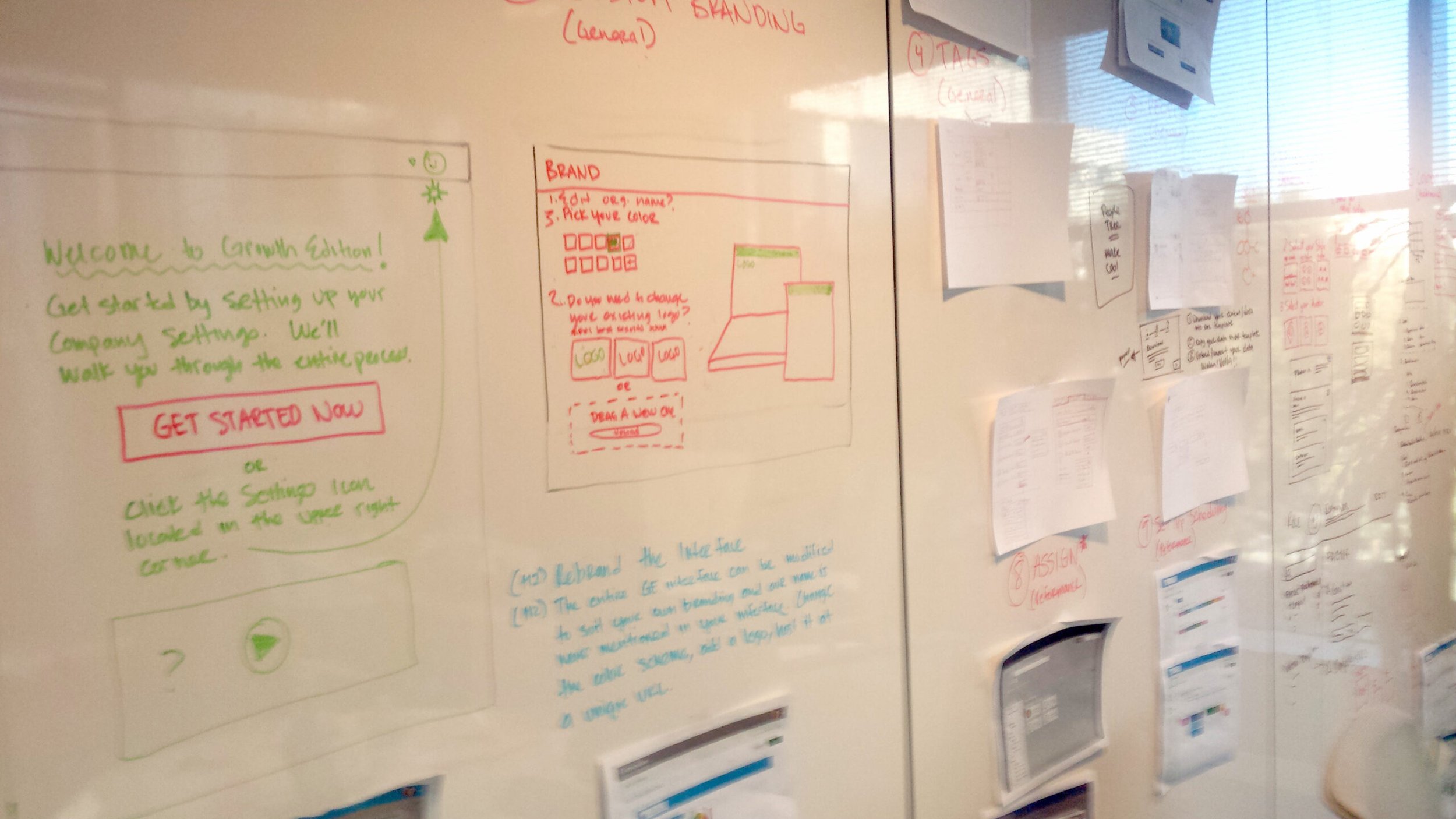
Next, we locked some key participants (design, engineering, customers) in a room and started ideating solutions in a multi-day design sprint.
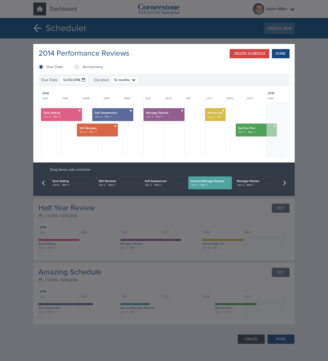

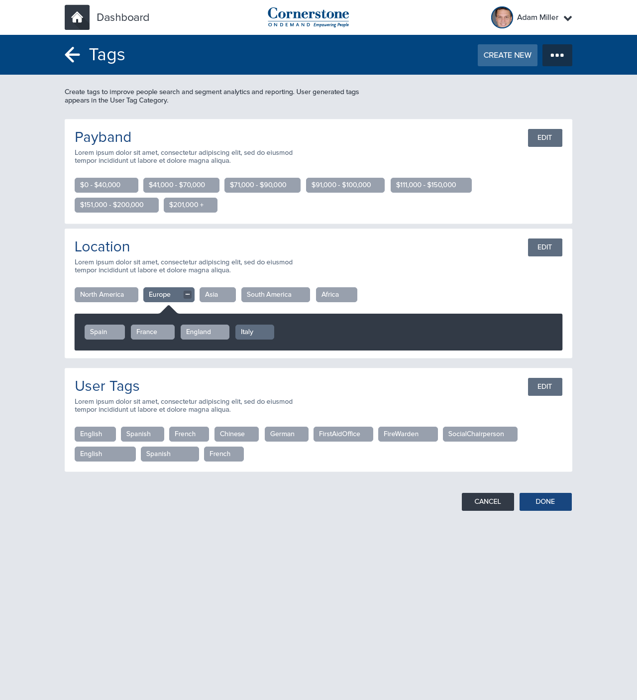
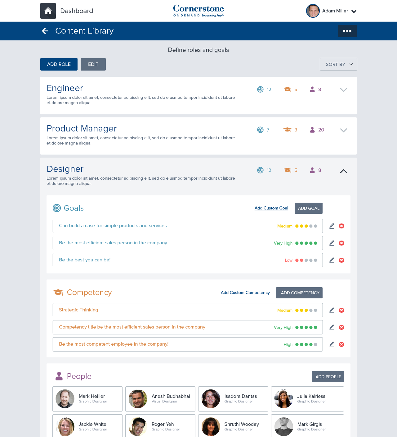
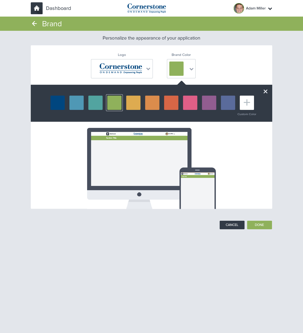
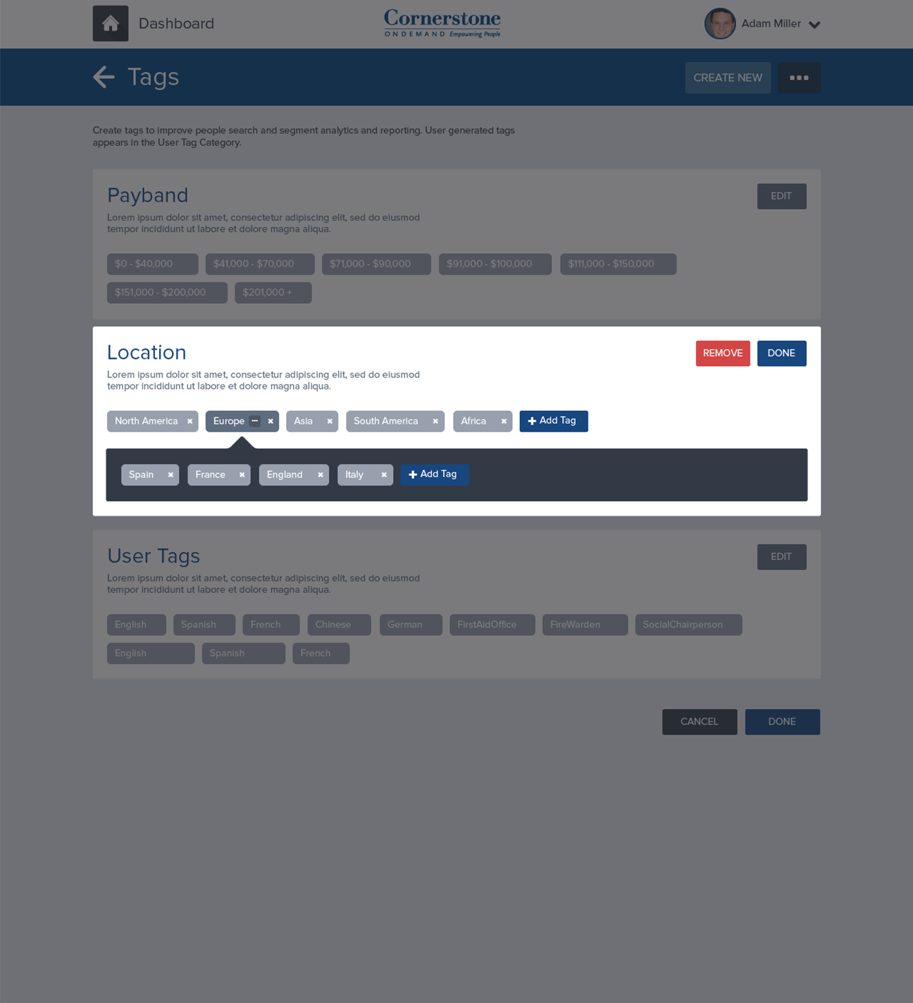

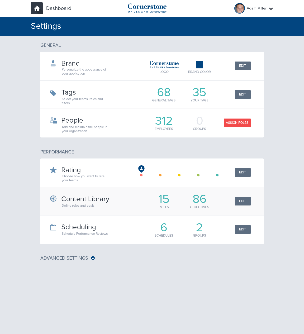
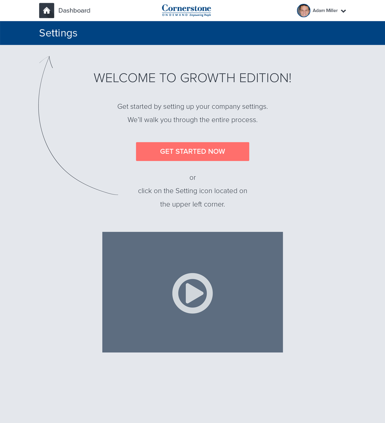


After the initial screens were designed we interviewed customers and learned by watching them react to the prototype
Testing
Eight new customers were recruited to participate in the study.
Setup
The following study utilized a usability testing methodology. Each session:
Lasted approximately an hour
Consisted of a brief introduction/orientation, completing tasks using the prototype, and a brief Q & A session at the end
Used Silverback App to record screen activity, including mouse clicks, audio, and video data
Assessment
To assess the effectiveness, efficiency, and ease of use of the product, each session was orchestrated the following way:
Friendly welcome. Welcome the customer and put him or her at ease. Explain that you’re looking for candid feedback.
Context questions. Start with easy small talk, then transition to questions about the topic you’re trying to learn about.
Introduce the prototype. Remind the customer that some things might not work, and that you’re not testing him or her. Ask the customer to think aloud.
Tasks and nudges. Watch the customer figure out the prototype on his or her own. Start with a simple nudge. Ask follow-up questions to help the customer think aloud.
Be thinking about:
Success rates: Were participants able to successfully complete the given tasks?
Ease of Use: How did the participants describe their experience
Identification of issues: How frequently were the issues identified by participants?
Debrief. Ask questions that prompt the customer to summarize. Then thank the customer, give him or her a gift card, and show the customer out.
The results
Findings
Users found the prototype was highly improved in visual design and provided a comfortable work environment. The study identified a few issues including:
Setting Up: Although most users understood that the Settings Page was meant to establish system-wide settings, it was still quite jarring for some participants to start by working through the setup process.
Settings Section: The current ordering of the sections may not best reflect user priorities.
Navigation: Many users did not know how to successfully navigate within the system. Additionally, most page descriptions weren’t very effective at describing what tasks the user could do in each section.
People Section: Few users understood the main organizational chart graphic when they first saw it. Although eventually, it is learnable, it is not very understandable at first use.
Anxiety Causing Events: While moving through various workflows, many users voiced fear of accidentally sending.
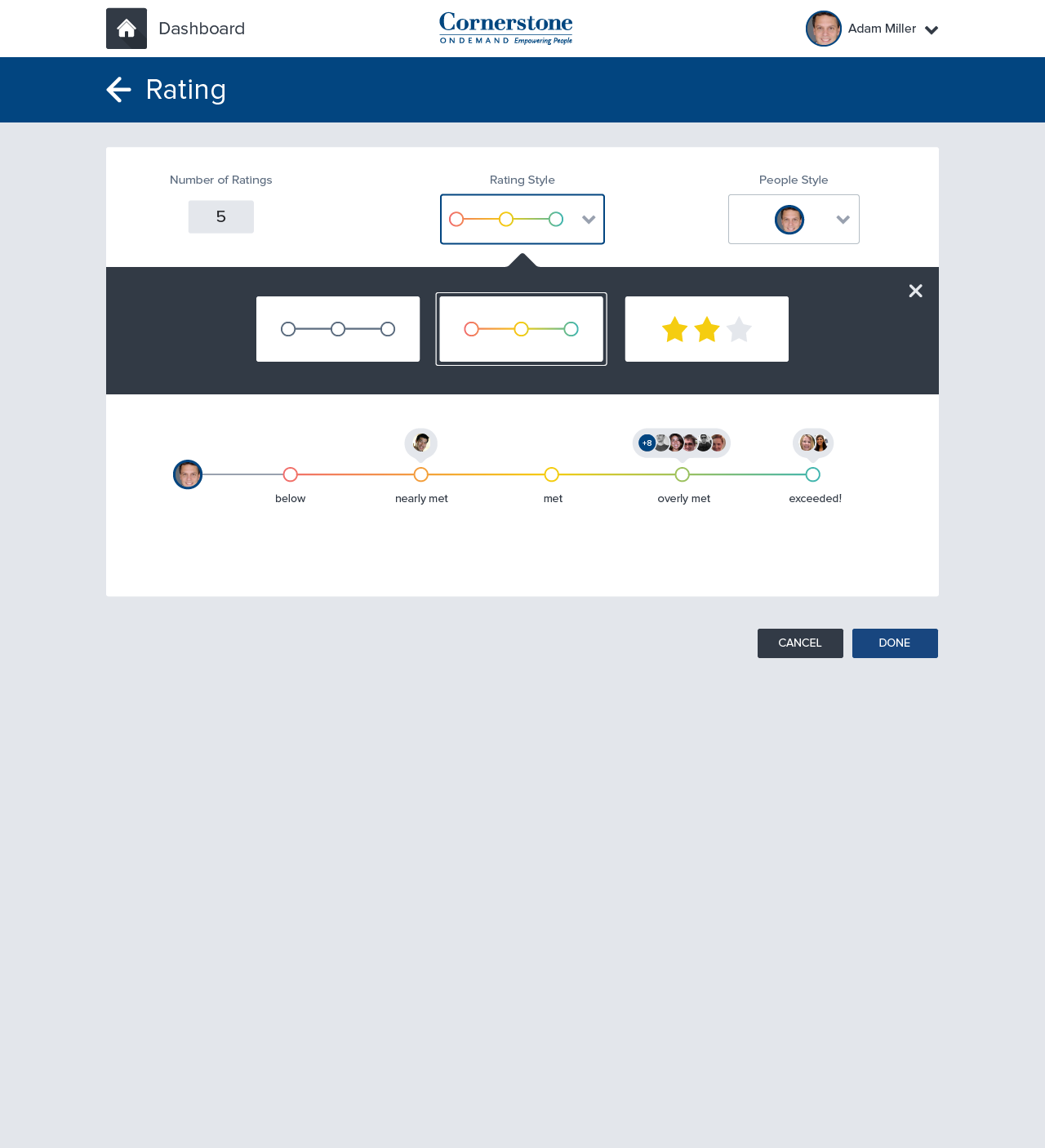
Rating: Scale Section & Page
Rating Scale: All users understood the performance rating section and that any adjustments made to the scale would be applied to all. Although all users were able to identify the meaning and purpose of the rating scale, some reported thinking that the defining subtext for the section was unclear. Consider making the Rating Scale subtext more descriptive to provide a clear meaning of its purpose and function to users.
Rating descriptions: All users expressed a desire to customize rating descriptions and recognized that this was allowed by the system. Consider adding default rating descriptions to the scale and allow users to edit as needed. A visual cue may need to be added to the default rating descriptions to signify to users that the text can be customized (e.g., include a Twitter-type word or character countdown).
Rating: Scale Customization
Label style: Most users enjoyed the face label style, but reported they would never use them. Users expressed difficulty in using faces due to their potentially ambiguous meaning. They reported a lack of confidence in matching a face with traditional rating descriptions (e.g., met expectations). Most users preferred using the star label style. Consider using the stars as a default label style that users are able to change.
People style: All users understood the meaning and application of People Style. The image marker was most widely used, however, there is no indication of how the images are added to the system. If People Style includes markers featuring employee images then the ability to upload employee images will need to be included in the Add a Person workflow.
Customization live preview: Most users were confused by the customization preview and expressed concern that the changes were being dynamically applied system-wide as they were made. Change Done to a “Save” type of button to assure users that changes are only made and applied to the system when they are finished customizing. Use only one People Marker on the scale to illustrate how they are applied.
Dashboard: Edit
Edit dashboard: Most users understood how to delete tiles, but were unable to add tiles to their Dashboard because they missed the drag and drop module at the bottom of the screen.
Some users were confused about why they could only remove certain Tiles from their Dashboard and not others.
Some users were unsure if they could rearrange the placement of Tiles on the screen.
Move the Edit module above the widgets to increase visibility. Consider including an “+” (add) button on a blank tile to increase the discoverability of the add a tile function.
Consider including an icon on each tile (when in editing mode) that signifies to the user that Tiles can be moved and rearranged.
Provide clarification about why some tiles cannot be removed from the Dashboard.
Clarify drag and drop action with an appropriate, descriptive copy.
Check out the reviews
“Pros: User experience and ease of use.”
— Carla T., 51-200 Employees, from Software Advice
“PiiQ has made my life easier. It takes no time at all to launch compliance training to one person or to the entire company. Our new hire turnover within the first year has gone from 57 percent to 29 percent.”
— Michelle Griffin, Director of Human Resources, Homes by WestBay
“PiiQ has made my life easier.”
— Jason Budman, Director of Human Resources and Store Operations, Cole's Hardware Inc., 51-200 employees


