Taking performance reviews from painful and boring to simple and meaningful.
Date: 2017
Role: I lead the charge on the entire brand program, video storyboard and production, and conducted naming workshops in collaboration with my creative team and the SMB marketing team. (Before this project, I designed the software.)
Type: Brand identity, Product videos (2), Naming architecture, Website
The brief: Cornerstone is one of the world’s largest companies in the HR technology space. The software primarily targets enterprise organizations, and Cornerstone wanted to go to market with a digital learning and performance solution that was custom built for a small or midsize business (SMB) and ditch the “one size fits all” approach.
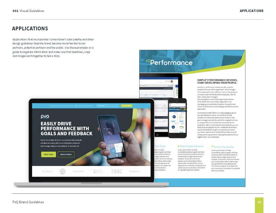
The solution: Build a brand that is unique to the parent brand Cornerstone yet has some association should customers choose to expand their offering. Double-down on the sleek, app-like interface user experience with marketing that targets a younger market of today’s smaller business customers. Use vibrant and energetic highlights, creating a full language referencing the arrows to a successful work-life.
Product launch videos
Brand architecture
We wanted a brand that was individual and distinctive but still tied to the main brand Cornerstone.
Considerations:
We didn’t want something too generic or descriptive (I.e., Small Business Performance Reviews) or an entirely made-up word that didn’t have a tie back to the product. We wanted the word to be in common linguistic use not directly describing the ingredient (i.e., performance reviews) but helping tell the story of the product value proposition. We preferred something short and memorable. We also needed it to be suitable for international offices and work well with the parent brand name Cornerstone. It was also important we considered competitors’ names and differentiated ours. Lastly, it needed to have an available URL and social handles.
Strategy:
We ideated around the product attributes of being nimble, flexible, modern, uncomplicated, all-in-one, and accessible from anywhere. We took into account product and end-user benefits of leadership, advancement, goal achievement, searching/finding, inspiration, motivation, success, greater control, insight, intuitive usage, feedback, coaching, and employee development. We also explored a range of tonal styles preferring not so serious but more fun.
Naming
After 40+ ideas, here is the shortlist—spoiler alert; we chose PiiQ.
“Of the many potential names we considered, we particularly liked PiiQ because it’s short, simple, and derived from the word peak, P-E-A-K. Given our objective with this product is to help SMBs and their people reach their highest or “peak” potential, it’s a great fit.
”






Logo ideation
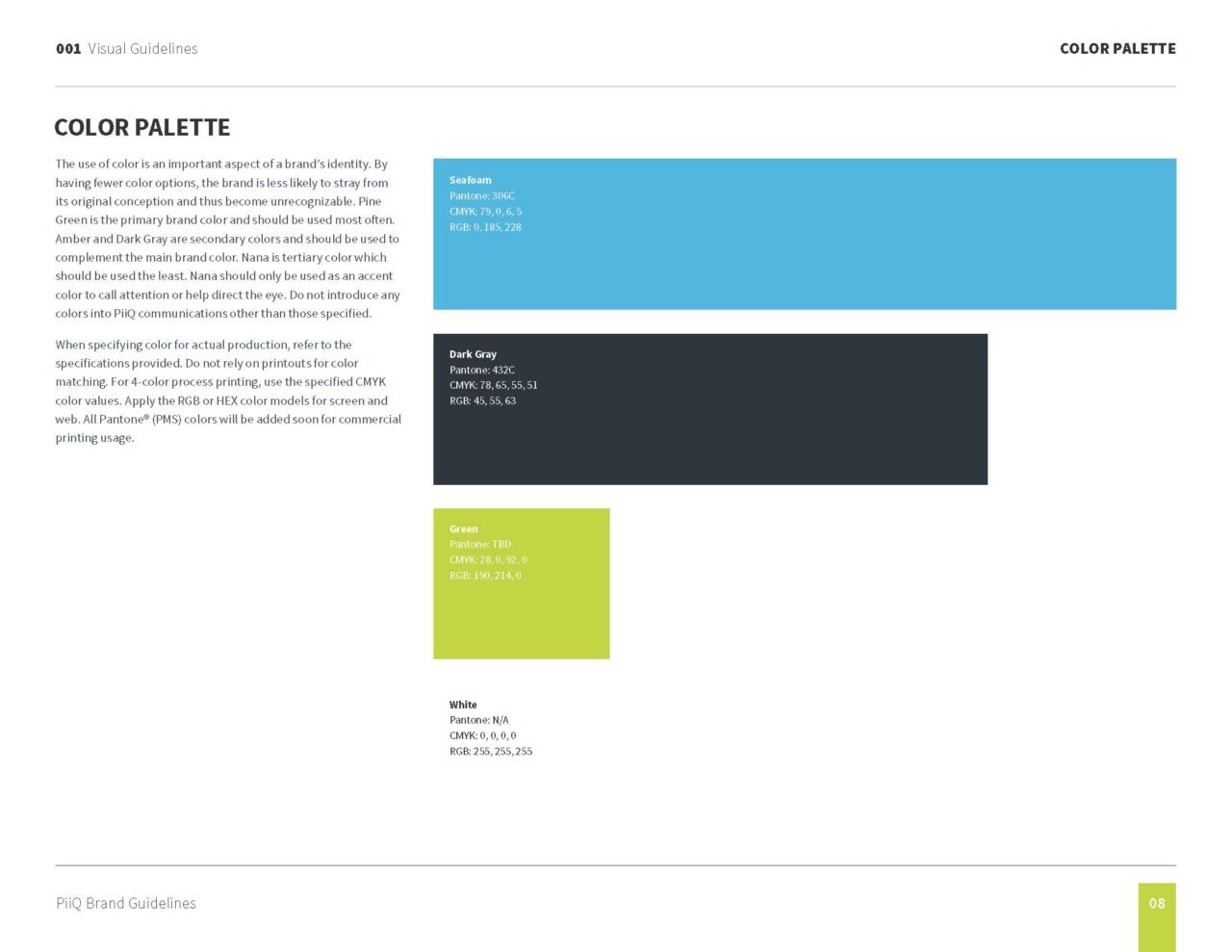
We wanted to be more expressive, and more outgoing with our identity. We kept the secondary color Seafoam (from Cornerstone’s main brand) and added a lime yellow.
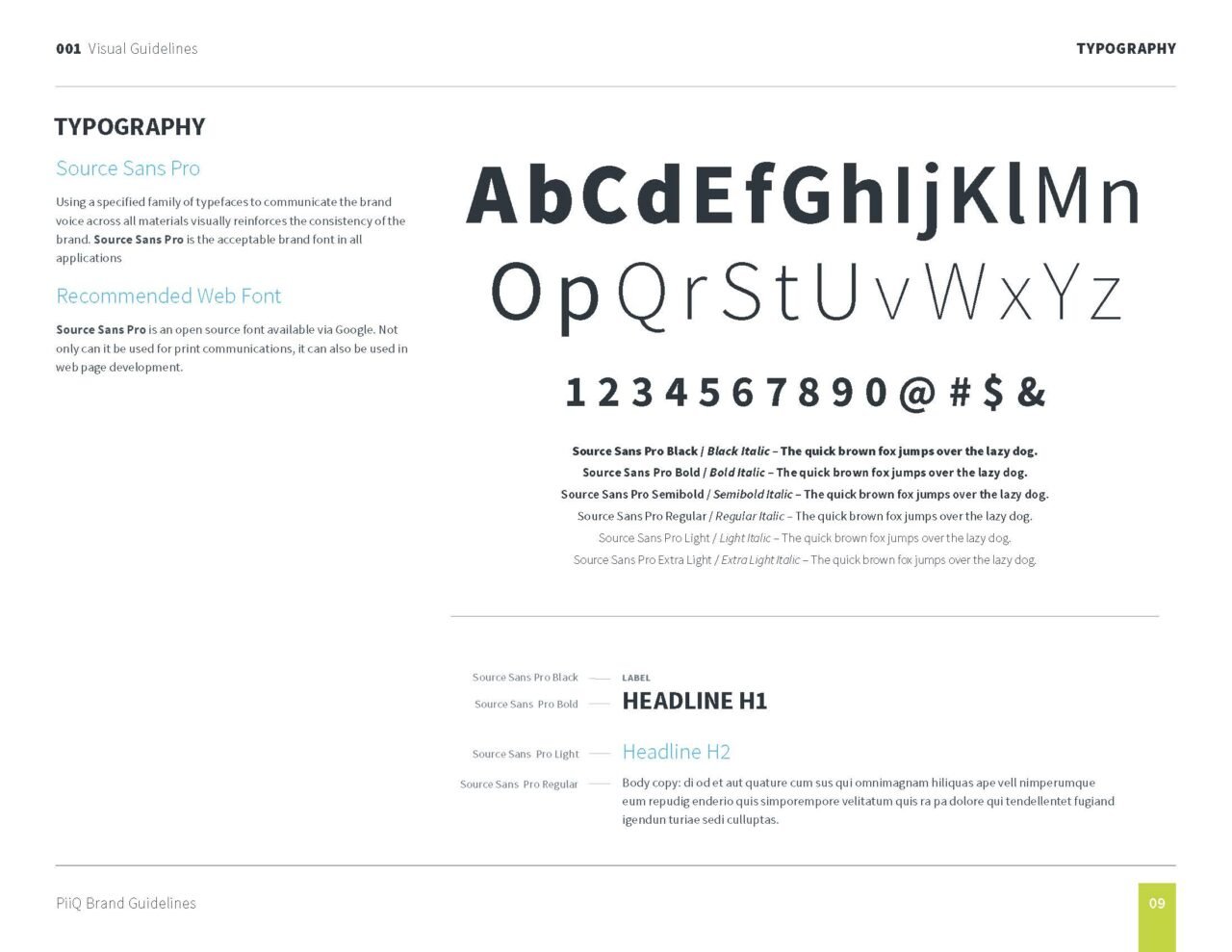
“The primary typeface is Ivar Soft, a custom font with a warm, approachable feel, important for small businesses.”
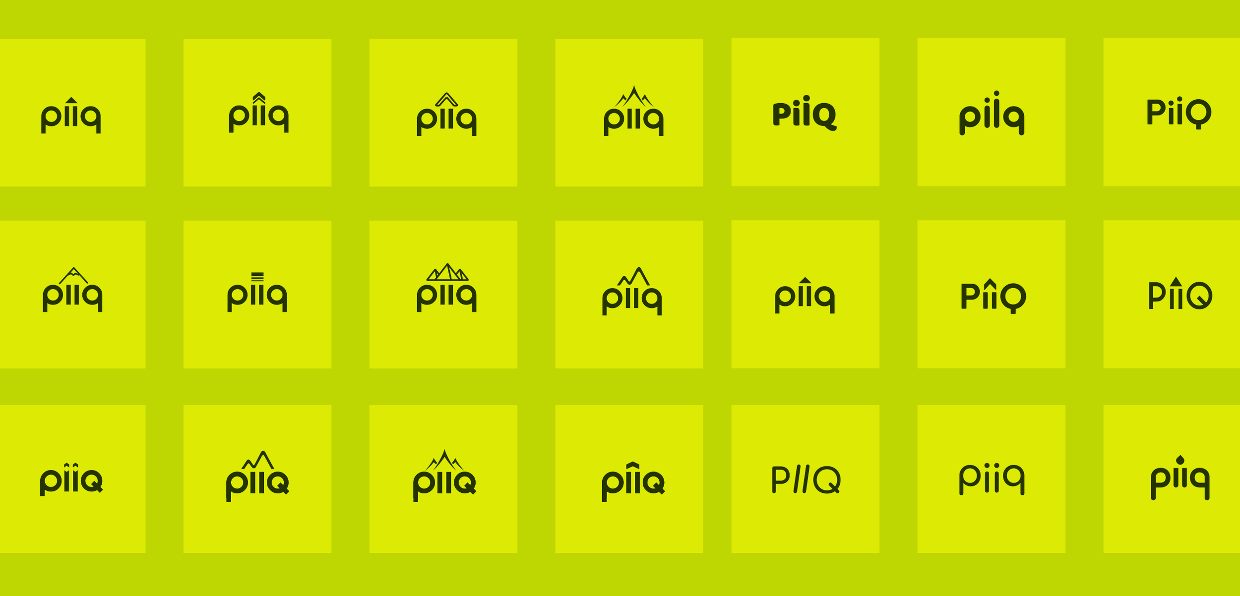
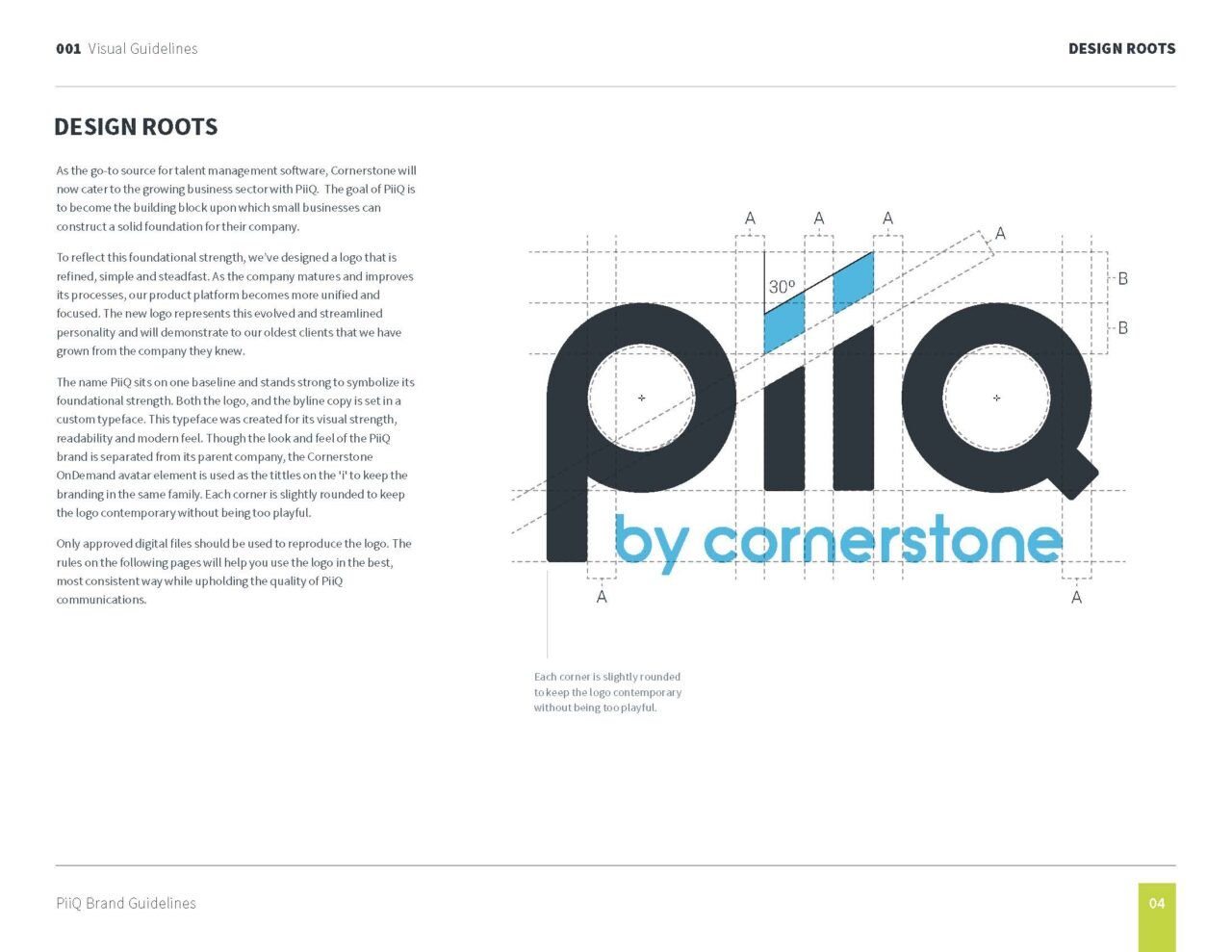
“Built into the geometry of the logo are hidden arrows, an apt symbol for what PiiQ does..”
— Adma Miller, CEO and Founder, Cornerstone OnDemand
“The PiiQ arrows come to life in a secondary graphic language inspired by steps to reach the ultimate height of performance.”
