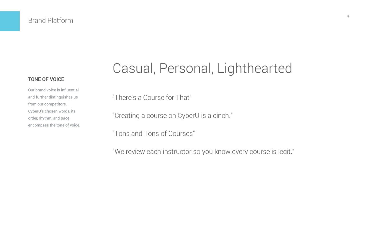
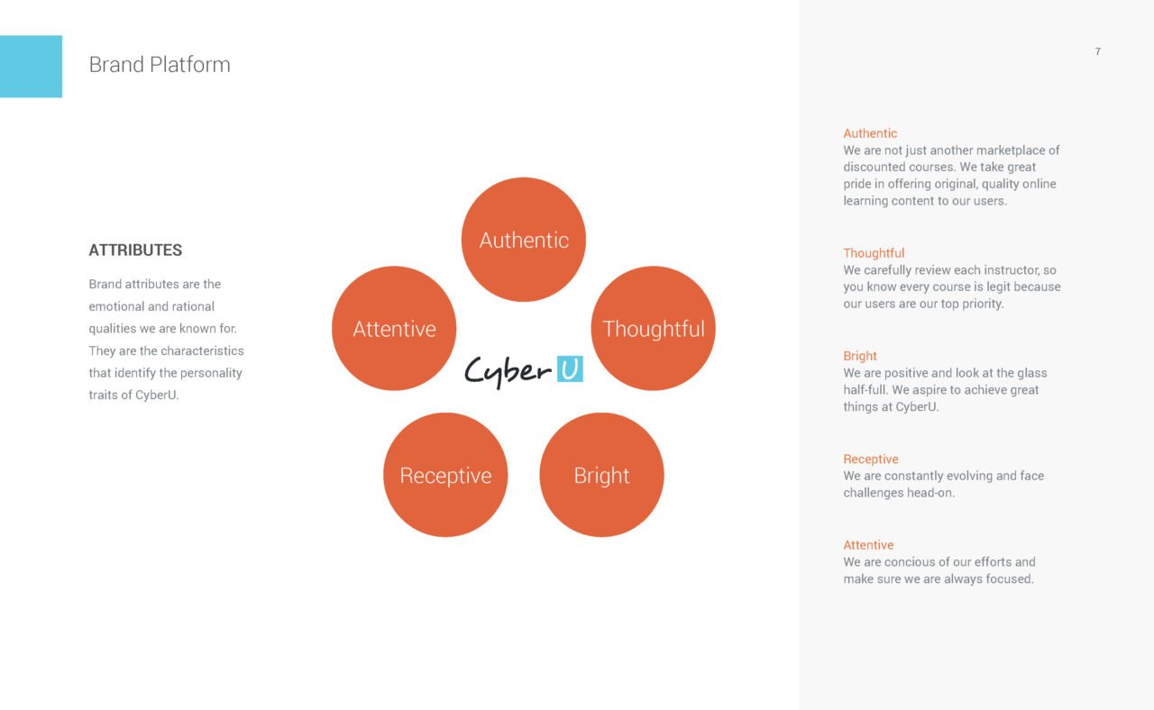
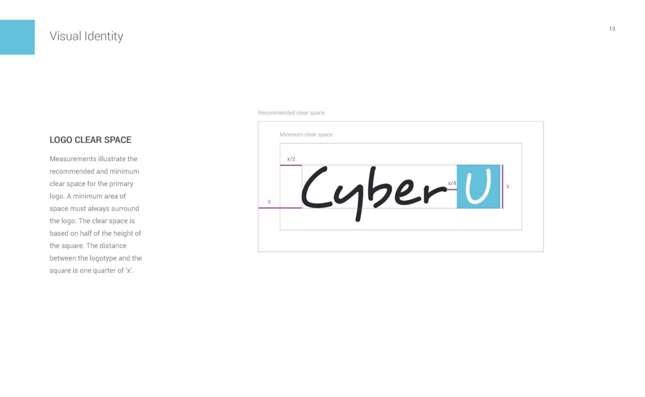
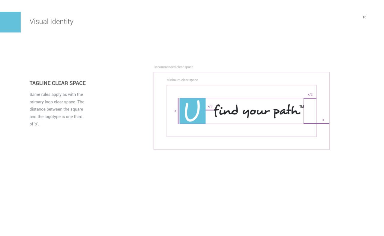
CyberU is a B2C online learning platform. I worked with the startup team to define the brand and the design experience.
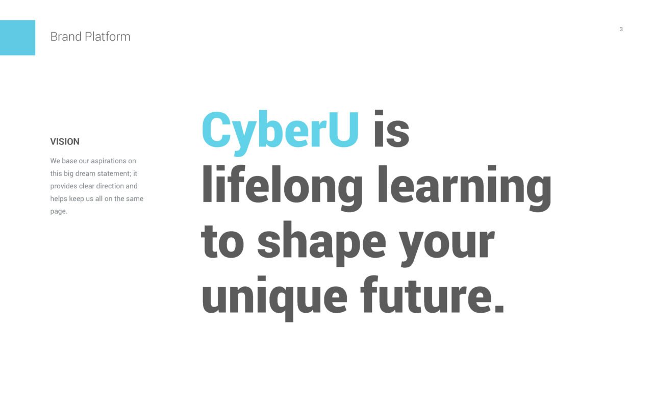
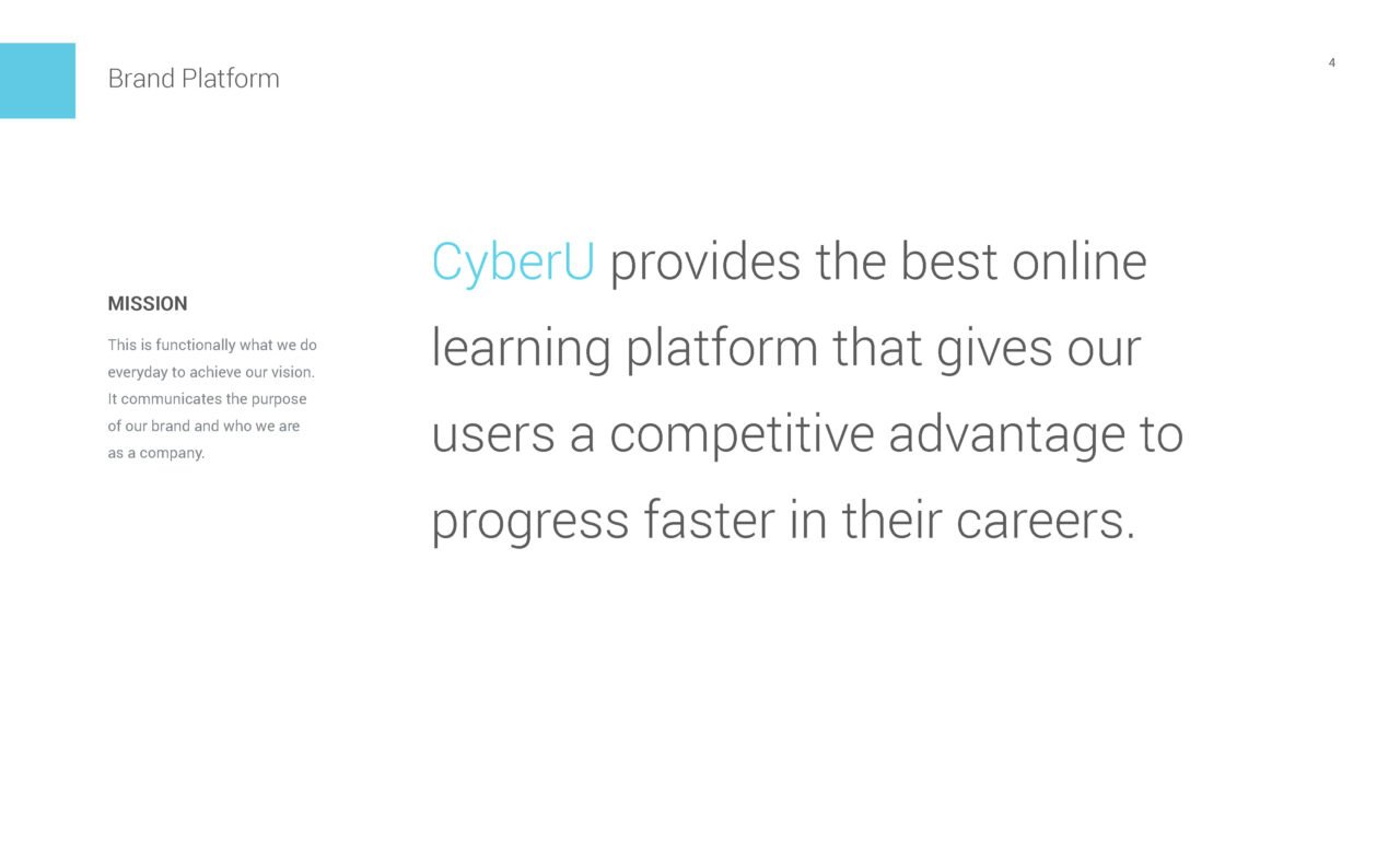
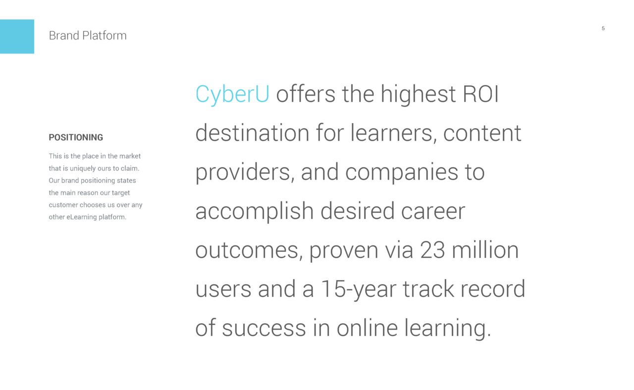
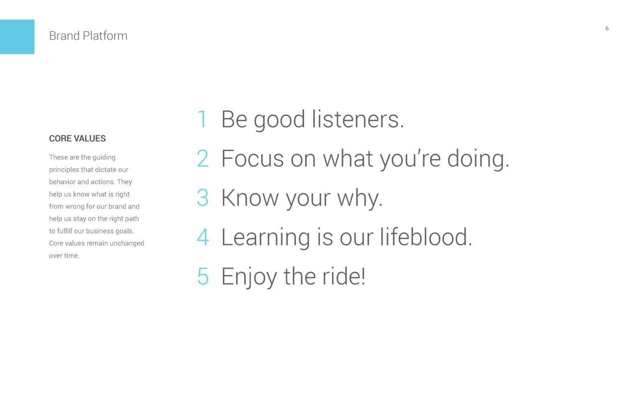
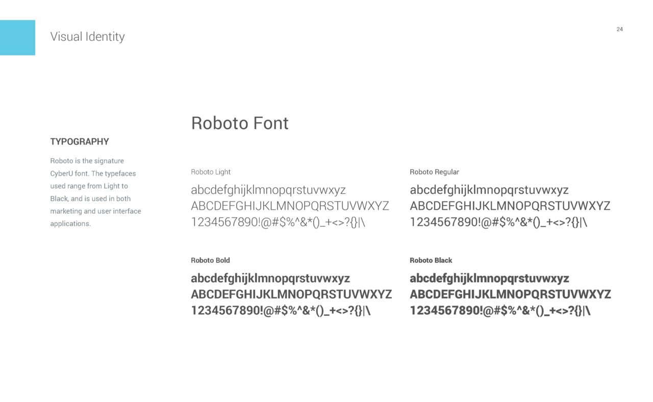
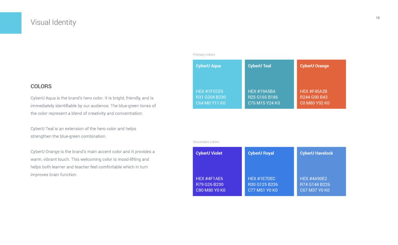
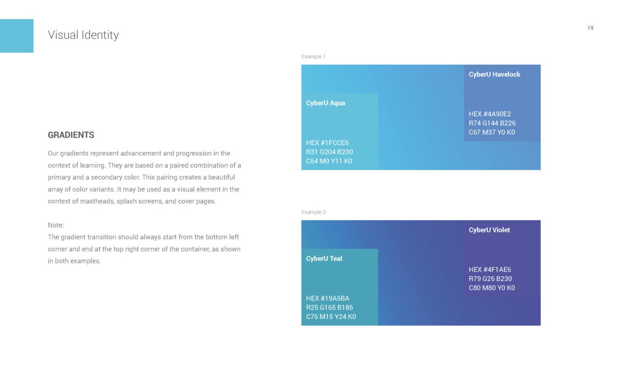
Brand guide

Product experience design
Competitive audit
We conducted a review of competitor designs to better understand feature comparisons and product positioning. This audit is used as a way to align project direction and positioning while providing design guidelines for the design process. Below is an executive summary of our findings.
What worked, what didn’t.
Oh yes!
The more specific and clear the quality assurance (QA) requirements are to a provider, the more consistent content will be throughout.
An approval process is necessary for enforcing QA standards.
On a learner’s dashboard, there is a balance to achieve between keeping users on track with the courses they are enrolled in and getting them to sign up for additional courses. It is important to support learners in accomplishing their goals.
To pique the interest of learners, courses on their feed should be tailored toward their interests.
Speed control in video players allows learners to watch the video as fast or as slow as they want to, giving them control of the speed of their lessons.
Discounts on annual packages, gifting, exclusive discounts, and indicating that a large number of students have enrolled help to incentivize learners to buy courses.
Mobile sites should be simplified and tailored toward common user goals (such as watching courses over reading a course description).
For mobile, breaking tasks (such as filtering results) into steps eliminates the need to scroll or zoom.
Organizing videos and project file uploads under each lecture will establish a clear hierarchy and guide providers through the course creation process.
Oh no!
It is vital that the QA requirements are easily accessible. Skillfeed’s requirements were only available through a link in an instructor help section, which made it difficult to find.
Web distribution (web widgets) options were not available for providers. (Offering this may be a key differentiator for CyberU)
Requiring payment information for free trials can deter users.
Having excessive badges makes them less meaningful in gamification.
The design of a certificate significantly impacts its perceived legitimacy. Playful colors and childish fonts leave a less professional impression.
For certificates to mean something, they need to be affiliated with a prestigious institution, be well-recognized and respected, and/or have strict criteria for completion.
Websites should be responsive, especially if a mobile app is not available.
Search and signup CTAs should not be difficult to find.
Try to avoid excessive scrolling when possible, as users can lose track of where they are and get lost.
Some learning interactions don’t work well on mobile. For example, It is difficult to input code on a mobile device during coding training sessions.
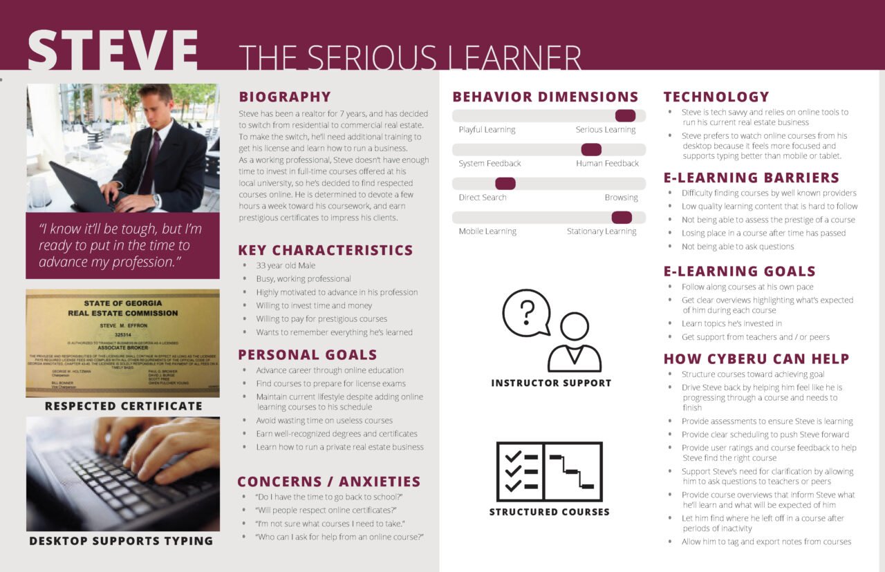
Persona development
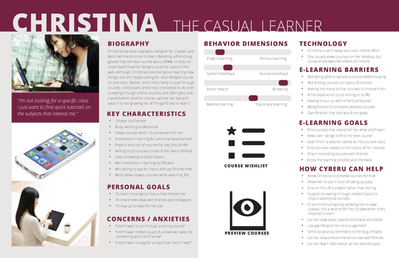
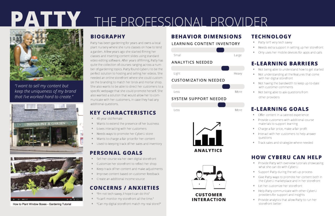
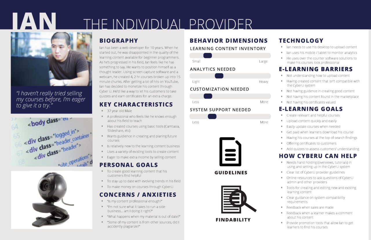
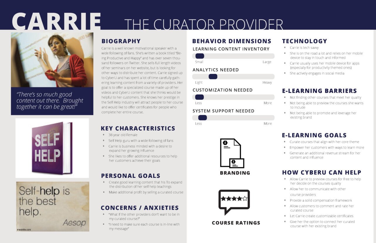
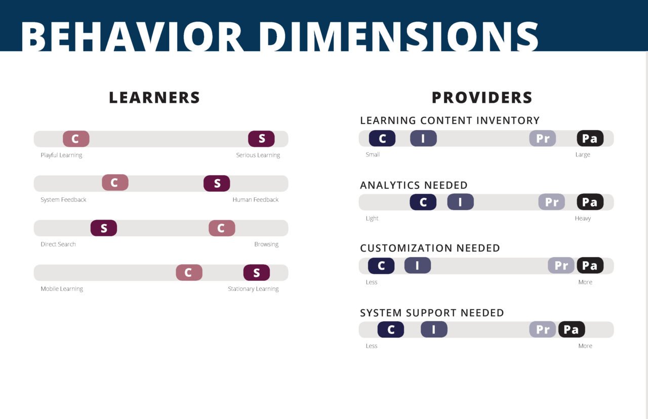
User interviews + affinity diagrams
We interviewed 18 online learners internally. Participants were selected who had taken an online course within the last 6 months from an existing online learning service. These findings were used to inform the development of ad hoc personas to support the design direction of the CyberU experience.
The majority of participants wanted an organized course structure, with an overview of course objectives.
Most participants wanted the flexibility to learn at their own pace/schedule.
Many prioritized keeping track of their course progress.
The majority of participants we interviewed preferred to learn course material independently. (on their own)
Some participants desired more social interaction in e-learning.
There was no common trend with social network sharing about e-learning. A few encouraged their friends to take online courses and were interested in what their friends were taking, but others were not “sharers” and did not post any of their accomplishments on social media.
Some participants had little patience for bugs, etc.
Some learned casually (multitasking, watching videos / TV on the couch)
Many participants expected free courses to be of lower quality and paid courses to be of higher quality.
The majority of participants were not willing to pay for a course out of pocket.
The majority of participants were motivated to learn by their careers.
Many participants were unmotivated to complete their courses.
A few were self-motivated to learn for their own pleasure.
Many participants said that they would benefit from gamification.
However, many participants did not like being overly rewarded, and did not care for sharing superfluous rewards such as badges.
Game elements simply for the sake of “games” quickly become disruptive
The majority of participants found it difficult to keep up with courses and balance their schedules since they were “busy professionals”.
Each learning session ranged from 20 min to 3 hours, with most participants spending about an hour when participating in online learning.
The majority of participants did not use mobile for e-learning and only used the desktop.
A few liked mobile because they thought that being able to access courses offline, from anywhere, on any device, would be convenient.
Many participants enjoyed real-world examples of how to apply their learned skills.
Some participants sought quick and absorbable content/reference material.
When determining which courses to take, assessing quality was an important task.
Participants sought a good search experience
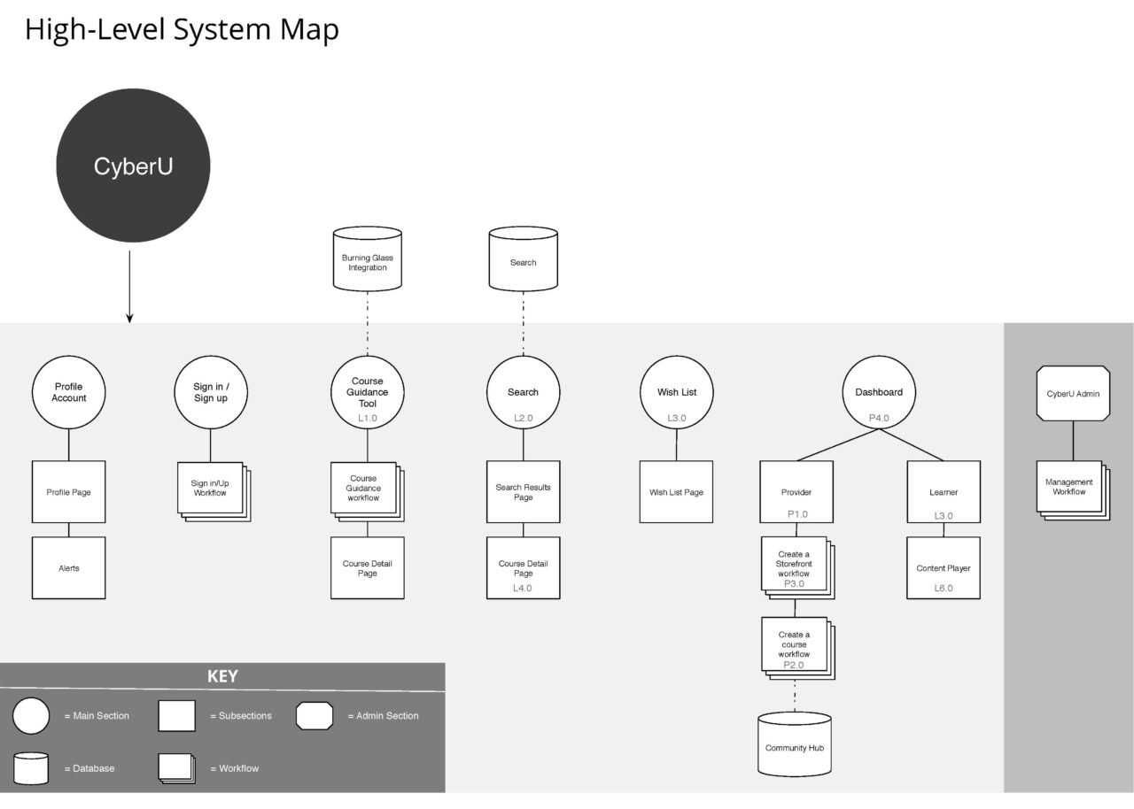
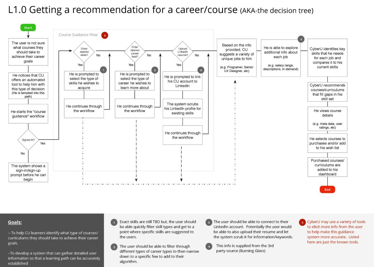
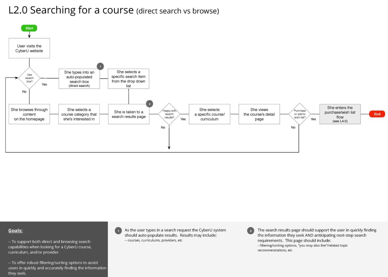
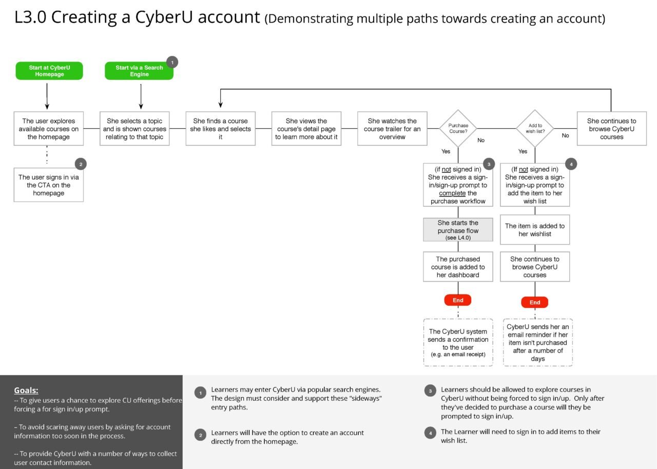
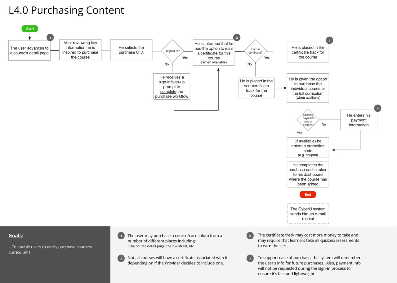
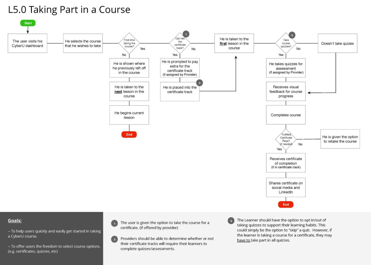
User flows
Wires + Designs
